Cream brick has quietly become the go-to foundation for modern home exteriors. It’s neutral enough to pair with nearly anything, warm enough to feel inviting, and durable enough to last decades without fading. But here’s the catch: choosing the right accompanying colors for your cream brick house can make or break your home’s curb appeal. The difference between a stunning facade and a flat, forgettable one often comes down to trim, roofing, and accent colors working in harmony. This guide walks you through seven proven color combinations that homeowners are using in 2026 to transform cream brick from a safe baseline into a showstopper exterior.
Table of Contents
ToggleKey Takeaways
- Cream brick house color schemes work best when paired with complementary trim, roofing, and accent colors that create contrast while honoring the warm undertones of the masonry.
- Classic combinations like cream with charcoal trim, black accents, or sage green provide timeless curb appeal across various architectural styles from farmhouse to contemporary.
- Testing paint colors in different lighting conditions and at various times of day is essential before committing to a full exterior paint job to ensure satisfaction.
- Cream brick pairs exceptionally well with warm white trim and neutral shutters for sophisticated, monochromatic looks that emphasize architectural detail and resist trendy dating.
- For contemporary homes, cream brick works with steel gray trim and modern metal roofs to create a clean, urban aesthetic that stands out in the market.
Why Cream Brick Works As Your Home’s Foundation Color
Cream brick sits in a sweet spot between warm and neutral. Unlike pure white brick, which can feel clinical, or red brick, which demands careful pairing, cream brick is forgiving. It reads as clean and classic without screaming for attention.
From a practical standpoint, cream brick masks dust and weathering better than lighter alternatives and doesn’t absorb heat like darker masonry. Building codes and energy efficiency aren’t directly tied to brick color, but the thermal behavior matters for long-term durability and HVAC efficiency, something to keep in mind for your home’s overall performance.
When you’re selecting a color scheme around cream brick, you’re working with a warm undertone. This means your secondary colors, trim, shutters, doors, and roofing, should complement rather than compete. The most successful combinations honor this warmth while adding contrast where it counts.
Classic Cream and Charcoal: A Timeless Contrast
If you want instant polish, cream brick paired with charcoal (or dark gray) trim creates a sharp, designer-approved look that works on virtually any home style. The contrast is clean without being jarring.
Here’s how to execute it: Use charcoal for front doors, window trim, and fascia. Pair this with a charcoal or slate gray roof to anchor the composition. The cream brick provides warmth: the dark elements create definition and make the facade pop from the street.
This combination works especially well on modern farmhouse and contemporary styles. Paint your front door a matte or satin charcoal (avoid glossy finishes, which look plastic and date quickly), and carry that color through to shutters and trim details. The result feels intentional and architectural rather than accidental.
When selecting charcoal paint, aim for true dark grays (RGB values around 70-90) rather than pure black, which can look harsh. Benjamin Moore’s Wrought Iron or Sherwin-Williams’ Tricorn Black are industry standards, both are widely available and weather reliably.
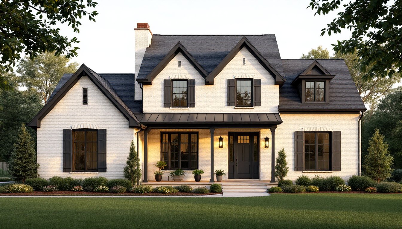
Warm Cream With Black Trim and Dark Roofing
A step bolder than charcoal is pure black trim paired with cream brick. This is higher contrast but reads as classic rather than trendy, especially on homes with strong architectural bones.
Black shutters, black window frames, and a dark asphalt or architectural shingle roof create unmistakable curb appeal. The cream brick prevents this scheme from feeling austere or funeral. Instead, the warmth of the masonry softens the boldness of the black.
This palette is particularly popular on colonial and Mediterranean revival styles. The homes featured in exterior house colors and paint ideas often showcase this exact combination because it photographs beautifully and feels timeless.
Pro tip: Reserve pure black (#000000) for doors and accent areas only. Use a dark charcoal for larger trim runs, pure black on expansive trim can look one-dimensional. A professional painter can show you samples in various lighting conditions to confirm the final effect.
Soft Cream Paired With Sage Green Accents
For homeowners who want warmth without drama, cream brick with sage green trim, shutters, and a coordinating roof creates a serene, approachable exterior. This works beautifully on cottage and farmhouse styles.
Sage green, a muted, gray-green with enough blue undertone to feel sophisticated, sits naturally in the landscape. It echoes natural elements without competing with landscaping. Pair it with a warm tan or cream-colored roof to keep everything harmonious.
The key to this palette is keeping all colors soft and muted. Avoid bright or saturated greens, which clash with cream’s warmth. Farrow & Ball’s Mizzle or Sherwin-Williams’ Sea Salt are sage options that consistently work. Paint your front door sage, carry the color through shutters and trim fascia, and let cream brick do the heavy lifting.
This combination is practical for resale appeal: it’s distinctive enough to stand out without being polarizing. Homeowners appreciate the intentional, nature-inspired approach.
Cream Brick With Warm White and Tan Shutters
Sometimes the most elegant solution is subtle. Cream brick with warm white trim (not stark white) and tan or warm gray shutters creates a cohesive, monochromatic look that emphasizes texture and architectural detail.
This palette is ideal for homes with established landscaping or complex architectural features. By keeping colors in the warm, neutral family, you let stone fireplaces, detailed cornices, or period trim work as visual anchors. The eye travels over all the details instead of getting caught on color contrast.
For this scheme, choose a warm white for trim, something like Benjamin Moore’s Chantilly Lace or Sherwin-Williams’ Pure White, which have subtle warmth rather than the blue-white of standard white. Pair with tan shutters (think natural linen or warm sand) and a warm-toned roof.
The result is sophisticated and timeless. It’s especially popular in established suburban neighborhoods and works across traditional, cottage, and contemporary-traditional styles. Your home won’t look dated in five years because you’re avoiding trend-driven accent colors entirely.
Modern Cream and Steel Gray for Contemporary Homes
If your home has clean lines, a flat roof, or minimal ornamental detail, cream brick with steel gray (not warm charcoal) trim positions it firmly in the contemporary category. Steel gray reads cooler and more urban than charcoal, creating visual separation without warmth.
Use steel gray for doors, windows, fascia, and a metal roof accent trim if applicable. Pair with a modern standing-seam metal roof or concrete-gray asphalt shingles. The palette feels current and designed, not retro.
Research from home interior design inspiration shows that contemporary homes with carefully coordinated gray palettes consistently outperform in both aesthetics and market appeal. The trick is making sure your grays work together, steel gray trim, charcoal windows, and a darker metal roof should all feel intentional, not random.
This combination works for mid-century modern, new construction, and contemporary farmhouse styles. It’s particularly striking on homes with stone or metal accents elsewhere on the facade. Avoid this palette if your home has Victorian details or period shutters: the effect will feel disjointed.
How to Choose the Right Color Scheme for Your Home
Start by examining your home’s architectural style. A colonial doesn’t need the same palette as a contemporary ranch. Period-appropriate colors will always feel right.
Second, look at your landscape and neighborhood context. If mature trees surround your home, earth tones and greens work better than cool grays. If your neighbors skew toward warm tones, a steel gray palette might feel disconnected (though standing out can be a strength if executed confidently).
Third, test your scheme before committing. Request large paint samples from your contractor and mock up trim colors on a small section of your home. View them at different times of day and in different weather. Overcast skies, morning sun, and evening light all shift how colors read.
Research on farmhouse and country-style home ideas demonstrates that homeowners who spend time visualizing color combinations before painting report far higher satisfaction rates. Get samples. Test them. Trust your gut only after you’ve seen the colors in context.
Consider hiring a color consultant if you’re uncertain, a two-hour consultation ($200–400) is cheap insurance against a $5,000+ exterior paint job you’ll regret. Finally, remember that trim, roofing, and accent colors matter as much as brick. They’re not secondary: they’re equal parts of your home’s visual identity.